
5 Reasons why Businesses Love Responsive Website Design

With the exponential increase in the use and popularity of mobile devices, you cannot not have a website designed to adapt to mobile and other devices.
The easiest to achieve this is responsive website design.
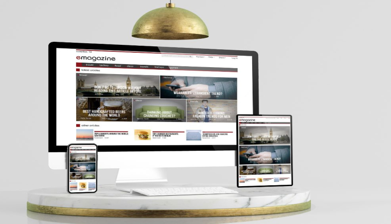
But, what’s a responsive website? How is it different from your existing website?
Simply put, a responsive website is a mobile friendly website. The website is designed such that it adapts to the size of the screen being viewed on. Whether the users are on a laptop or a mobile phone, they wouldn’t notice a difference between the two.
Why is it important to have a mobile responsive website?
There are several reasons why businesses love responsive web design. Here is a look at the most important ones.
Increased Traffic
Mobile is more mainstream than ever. You simply can’t afford to ignore the mobile users. And why would you create two versions of your website (for desktop and mobile users) when you can have just one responsive website that is ready for all devices. By 2021, more than 50 percent of all retail e-commerce is expected to be generated through mobile commerce. A responsive website ensures you retain mobile viewers and benefit from this mobile commerce boom.
Lower Cost and Website Maintenance
A responsive website may seem expensive upfront but the maintenance costs of two websites add up to much more than a responsive website. In short, a responsive website is a more cost-effective option for a business. In addition, mobile responsive websites take less time to setup and are easier to maintain than maintaining two separate websites. Responsive websites can also offer customized location-based offers to drive even more traffic to your website. The time and other savings allow you to focus on other important areas of your business. If you are looking for a place to start, you can seek the help of the web design team at one of the leading responsive website design companies, OgreLogic in Texas.
Matchless User Experience
You may have a great website but if it is not responsive, it would get distorted on mobile devices. The text may become jumbled, images would not align and users may have to scroll unnecessarily to get to the information they need. If navigation and search is a pain for users, they would either abandon it or never return. To enable a seamless user experience, it is best to go for responsive web design.
Screen Size Adaptability
Another benefit of good, responsive design is its adaptability to various screen sizes. It puts you ahead of competition as it positions your website to seamlessly fit to smartwatches, IoT devices, mobile phones etc.
Improves your SEO Efforts
Responsive websites have a better shot at higher ranking in SERPs. Responsive design and high-quality content will make users stay longer on your site and rank better on search engines. Google recommends a responsive website design pattern. In other words, responsive web design not only saves you lots of money, maintenance and time, it also helps you attract and retain more business in the long run.
If you are looking for mobile responsive website design, call OgreLogic in Austin, Texas at +1 (512) 861-8471 Today! OgreLogic’s web developers and designers, online marketers and analysts solve real problems through research, design and execution.


